Saturday, 5 March 2016
DPS Image Decisions
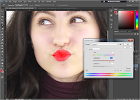
This was the final image I decided to include in my DPS. I chose this image due to the fun way, in which the model was posing. As the model is looking towards the left, I thought it would be effective to place the text on the left side of the double-page spread. This would result in the reader getting intrigued and not distracted by the image, or the text. To make the image look more appealing to the reader, I used Photoshop to brighten the red colour of her lips, and also changed the colour of her top from burgundy, to purple.
I adjusted the colours of both the model's lips and the top, to make them seem more vibrant. The colour of her lips is the same shade as the colour of the text I used on my front cover, contents page and my DPS. I chose to keep the same shade of red to make my magazine look consistent , and also to brighten the image itself. I also adjusted the colours of my model's top, to match the colour I had used on my front cover. By changing the colour from burgundy to purple, resulted in the image, as a whole, to look more eye-catching and not dull.
Subscribe to:
Post Comments (Atom)


No comments:
Post a Comment